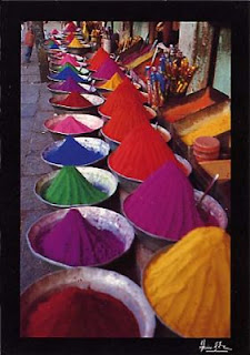
Besides from being the obvious Pavlov thing: You have learned that red is hot and danger and that white is clean (which you were not at a very young age) there may be more associations with colour than that.
It is getting more interesting when colour is culture related. because that would mean that in different countries we use colours differently in our art and photography, would it not? Once again, you could help by giving your interesting and witty examples...
Here is an interesting webpage about the relation between colour and music: homepage.eircom.net Visual Music by Maura McDonnell (2002) |
Peter Nagelkerke, retired former senior vice president Philips Design, made a presentation about how Vincent van Gogh ´heard´ colours: Van Gogh's Brain - "Play it again, Vincent" www.youtube.com/watch?v=bi4919qp3k8 |
Colour trends may defy instinctual, cultural and iconic constraints - for example, the recent craze for vivid lime green. As Jill Morton says: "Psychologically, the 'anti-aesthetic' colours may well capture more attention than those on the aesthetically-correct list. History clearly demonstrates that this has been a prevalent trend in art since the turn of the 20th century when Dada's urinals and snow shovels put an end to the era of Matisse and French Impressionism."³ quote from: www.sibagraphics.com/colour.php |
Our reaction to colour is instantaneous and this website, www.squidoo.com/colorexpert gives a quick look at general responses based on research, the historical significance of colour and word association studies. They even included links to colour personality tests that may give you some insight into your own colour associations as well as how you react to different colours. link: Color Me Delighted! |
Some make colour the goal in their professional work, as Ashvin Gatha's 'Living Colour' once a CIRCLE-24 photographer. |
| Here is a good link for the use of colour in art |
This is also interesting at: www.webexhibits.org/colorart/ch.html Goethe’s diagrams in the first plate of Zür Farbenlehre (Theory of Colors) include a colorwheel and diagrams of distorted color perception. The bottom landscape is how a scene would look to someone who was blue-yellow color blind. "..Above all, Goethe appreciates that the sensation of complementary colours does not originate physically from the actions of light on our eyes but perceptually from the actions of our visual system.." |


No comments:
Post a Comment